Our world is becoming increasingly digitized thanks to the compulsive use of the internet which has affected various domains and industries.
If you own a business, and you want to reach a larger audience, then you simply can’t survive without having a digital presence. It is standard practice for a business to have its own Facebook page, Twitter handle, Instagram channel, and now more important than ever before – a website.
The good news about website design is that you can have one up and running inless than 1 hour on a barebones budget.
But not just any website is going to work if you want to woo your audiences. What you need is a professionally designed, aesthetically pleasing, lead-catching, brand-defining website that resonates with your user base.
In order for any business to generate sales, they must first find a cheap and reliable way to reach their audience. Back in the good old days, telephones disrupted communication and played a key role in shaping society as we know it today. As telephones became adopted by households in droves, savvy marketers picked up on the advertisement opportunity and realized that it was a smart idea to get listed on ‘Yellow Pages’.
Yellow pages created credibility for businesses and also provided a way for prospective customers to reach out to businesses without having to visit them in person – it was convenient and worked. Getting featured on Yellow Pages became standard operating procedure for many businesses, local and international alike.
Fast forward to 2019 (soon to be 2020), and the vast majority of consumers are rapidly switching to online platforms. In fact, more than 97 percent of consumers use the internet to find a local business. This means if they can’t find you on search engine result pages and social media, you will most likely lose out on their business.
1- Top 14 Reasons Why Businesses Need Their Own Website
1.1- You Can Control Branding and Flow of Information
While it is great to have comments and reviews about your company (it shows you have an audience to cater to), it is unhealthy to let public opinions shape and form your brand image. Isn’t it better to control the information that is being shown to the public, and by extension, your reputation?
This is where an official website plays a huge difference because of the way it instantly creates official presence online so that you won’t have to depend on third party websites and businesses to speak on your behalf. Plus if someone is trash talking about your business or spreading false rumors you can always dedicate an FAQ page to systematically dismantle and refute their points.
The best part about having your own website? You can actually control the design and feel of each web page with your own choice of colors, logo and fonts.
1.2- A Website Meets Customer Expectations

Your customers expect to find some information about your company online. Not having a digital presence sends a negative message tothem, namely, that you’re stuck in the old days and are probably not interested in finding new customers. Neither of these will generate sales if that is your ultimate goal.
When customers enter information related to your business they are not looking for complicated information or several pages of encyclopedia. A website with a few simple pages with basic informationtailored to fit user needs is simple enough.
Just make sure that the information you put in is up to date and accurate, since nothing turns off customers more than outdated information. Search enginesalso pick up on old information that isn’t updated, this will tank your ranking.
1.3- Websites are Far More Affordable than Traditional Advertising
Did you know that you can now set up a website for less than a few dollars? At most you will only have to spend $10 or $20 for basic packages depending on the hosting provider. If you go for extra bells and whistles such as dedicated IP addresses and more processing power, you will have to shell out more money, but this is generally not needed for the vast majority of business websites.
Unless you are generating a ton of traffic and seriously need your own dedicated servers, a basic shared server should do just fine.
Even the most basic website is far more beneficial than taking on ad expensive ad space in those ever shrinking telephone directories, not to mention the fact that they don’t command nearly enough of clout with customers anymore.
Moreover, the cost of making and maintaining a website is decreasing every year, and for the most part, you won’t even notice a dip in your overall marketing budget.
1.4- B2B Transactions are Positively Influenced by Websites

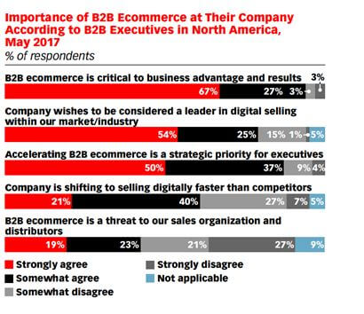
A whopping 67% of all B2B transactions for multiple pack-and-ship and industrial manufacturing industries were influenced by online shopping. Buyers are now spending more time to search for prospective businesses before spending money. Studies have shown that 58% of B2B purchasers in the industrial manufacturing research their products on the internet before following up with a brand.
The infographics below shows the percentage of B2B buyers and how extensively they depend on online research. The numbers were provided courtesy of Google and BCG.

1.5- It is Easier to Update Your Website
If you tried creating your own website a few years ago, you’ll notice that things were a little more complicated back then. Marred by poor navigation, clunky UI, seizure-inducing pop ups, and unappealing color schemes – older websites were definitely an eyesore. Updating these websites took forever and you could not make these changes yourself and had to wait for long hours with your developer over phone or email. Simple things like updating your store took forever.
Enter CMS tools like WordPress and Drupal – they now let you customize your website and make real time updates without learning a single line of code!
1.6- Boosts Your Presence

If you run a physical store, most of your sales are probably generated by local people near your vicinity. They are acutely familiar with your services and what your prices are, and will probablycome back for more. In hindsight, even the mostsuccessful businesses have a restricted area of reach if they rely solely on their physical presence. A website helps you bypass this limitation to reach a much, much wider audience.
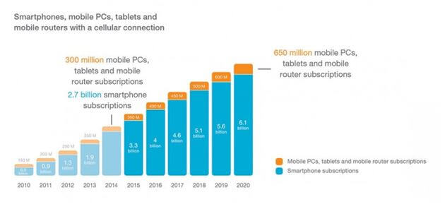
It is a statistical fact that of the 7.4 billion people in this world, 3.3 billion or 47% are online every single day! They are sharing viral posts with each other, searching for information, and buying products through online stores. So far, the trends don’t show any signs of stopping or even slowing anytime soon. Our dependency on smartphones have only ballooned the use of internet. In fact, surveys peg the actual number of smartphones to over 2.3 billion worldwide. This number will shoot up to 6.1 billion by 2020.
What does this mean for small and big businesses alike? You’re missing out big time! Digital marketing is a billion-dollar market that doesn’t require a billion-dollar budget to break ice. All you need is a cleverly designed website and a well designed strategy to generate income.
Just make sure your website is optimized to be mobile responsive so thatit can be accessed bythe much smaller screens on smartphones and tablets.
1.7- Provide Personalized Email Addresses to Your Employees
When you buy a domain for your website, you can also set up personalized emails that are extremely useful. Which email sounds more ‘legit’? jimmysales@gmail.com or jimmysales@researchersdigest.com? Any person who is remotely connected with the digital world will agree that the latter is far more professional and will likely sell more.
In the context of the bigger picture, this may seem like a small detail, but it is crucial in maintaining that first impression you made with your website.
1.8- You Can Now Make Sales Online
Once you have expandedyour company’s reach with the help ofawebsite, it is possible to generate ongoing sales on a 24/7 basis. In fact, it makes more strategic sense to sell your products through your ‘online shop’ instead of solely through your physical shop. The best part about online shops is that they are relatively simple to set up and allow you to make sales long after your sales team have gone home.
1.9- Building a Relationship with Your Users

A great website lets you foster a strong relationship with customers. This in turn helps you increase customer loyalty since they know they are dealing with a company that empathizes with their needs and isn’t just there to make money. Your website can play an important role in communicating this to clients with the help of the Home and About Us pages.
You can share information about core team members who are likely the brains behind the product and service. This allows you to add a human component to your business, which goes a long way in appealing to your market.
Consider setting up a blog page where you can share your ideas and thoughts with your audience. These blog posts will address the needs of the market by sharing information that isn’t available elsewhere. Make sure to invite your audience to post comments on your blogs or ask them to fill survey forms to better communicatetheir needs.
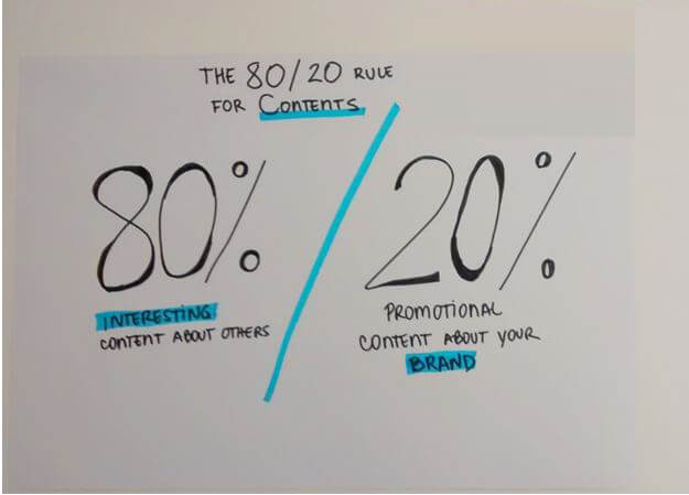
When it comes to generating content, remember the 80-20 rule; this essentially means that 80% of your content should address thepain points of youraudience while the remaining 20% should tell them how your business comes into the picture.
1.10- Build a Community with Customers
The best thing about having a website of your own is that you can provide a platform for your audience to talk to each other and share ideas. For example, the blog page of your business should enable the comment section so that visitors can ask each other important questions and engage in interesting discussions.
There are many tools that let you integrate your website with dedicated community features such as public chats and forums. Make sure to ask your developer about these features.
1.11- Create a Newsletter and Email List

When it comes to marketing, the most effective tool is email marketing since it lets you stay in touch with your customers long after they have purchased a product. In this regard, a newsletter comes in handy since it lets you share recently uploaded blog posts and send them directly into your clients’ inbox. In fact, you can drive a lot of sales and conversion with the help of online email campaigns.
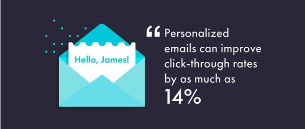
Make sure your website features online forms at appropriate places to get people to sign upto your newsletter. Once you have built a largeenoughaudience, you can send them as many customizedand personal emails as you want, as frequently as you want. Just make sure not to send too manyemails since they can easily annoy customers.
1.12- Learn More About Your Customers
Once you integrate appropriate ‘intelligence’ or analytical tools with your website, it is possible to learn a lot about your customers based on the web pages they visit, the time they spend on each web page how often they exit web pages, which buttons they like to click, and which pages piqued their interests most.
This information lets you further fine tune and customize your website based on real-time analytical data. For instance, if you see that customers tend to leave a particular web page in mere seconds, you know something’s not right and needs to be fixed. If the same customer then proceeds to spend 10 minutes on anther web page, this is a good sign, probably.
1.13- Promote Your Business More Efficiently
It is pointless to waste valuable time, money, and resources on traditional forms of advertising such as press release, flyers, print ads, and even television ads. They are simply too expensive and your target audience is likely not there. For startups and smaller businesses, traditional methods of advertisements cost more money and don’t cover nearly as much ground as a website can.
Not to mention the fact that traditional advertising methods are unsustainable and usually end up in the trash can.
1.14- Websites Level the Playing Field
Having your own website helps you beat the giants in your industry who may otherwise have a staunch monopoly over sales. Despite the huge marketing barrier between small businesses and Fortune 500 companies, a well designed website levels up the playing field. Your clients probably won’t be able to tell that you’re just a handful of specialists working in a niche area instead of having a team of over 1000+ people.
1.15- Improve Customer Service

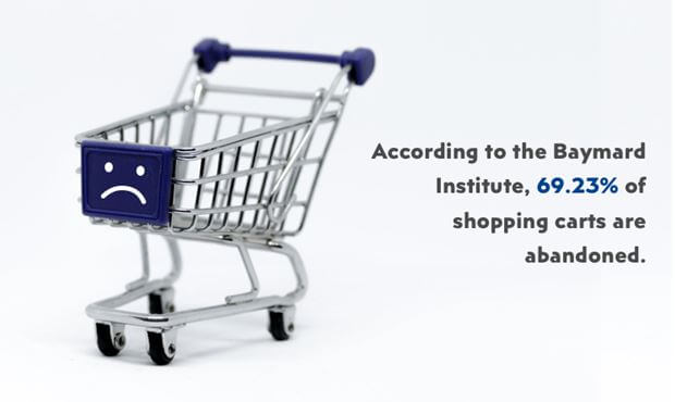
Good customer service helps you win new businesses and retain existing clients. Make your site user friendly and easy to navigate by focusing on details that enhance a client’s experience. For online stores, ensure that the ordering process is simple. Research shows that more than 50% of online customers abandon their shopping basket if they are unable to find a quick enough solution to their query.
This is also where live chat solution comes in. There are many life chat platforms that letyou integrate a live chat solution to your website. This way, whenever customers visit your landing page, yoursales staff will quickly be able to get in touch with clients.
2- What are the 16 Most Essential Elements of a Website?
Now that we have established how critically important a website is for your business, it’s time to discuss which elements play an important role in how potential and current customers perceive your company. When it comes to online activities, most customers don’t have the patience to put up with slow websites and will quickly lose interest if a website takes more than 3 seconds to load.
If the layouts and content are not engaging enough, this will also add to their boredom. It is good business practice to include your business’s contact information, besides, how else are customers going to purchase your products and services if they don’t have a means of reaching out?
HERE ARE 16 IMPORTANT ELEMENTS THAT YOU MUST INCLUDE IN YOUR WEBSITE
2.1- Use a Responsive Design
Online users appreciate a website that loads up fast and works seamlessly across a range of devices, especially hand-held devices. A large percentage of your customers will probably use their smartphones for web browsing. If your website does not load as well on mobiles as it does on desktop, you will notice your bounce rates jumping up by a significant margin. It is important to adapt your website for everyone so you can improve your site rankings, attract a broad range of customers, and decrease bounce rates.
2.2- Write a Compelling Company Story
Shoppers like to know who they are hiring and why. If you can create that all-too-essential personal connection with your customers, they will likely go through with a sale. Make sure to leave detailed information about core team members, the company vision, and why you are better than the rest. Utilize your About Us page for this purpose. Include a personal story that related to your business’s journey and how it was materialized from concept to incorporation.
The more personal information you share, the more credible and approachable your team appears – this in turn drives up the conversion rate.
2.3- Good Quality Content

Think of content as your website’s backbone. If your website provides users with engaging and high quality content that answers their question, they will likely convert in the future. Most businesses often compromise content in favor of advertisements for their site. Furthermore, good content plays a major role in your website’s search engine ranking, which you should try to improve every week or month.
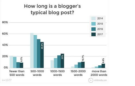
As a general rule of thumb, you should write larger posts to the tune of 1500+ words or more. Long form posts rank well with search engines. Your website’s text and visuals should be informative, easy to understand, and to the point. A strategically designed web copy will benefit your website more than advertisements.
2.4- Search Engine Friendly
Both content and SEO go hand in hand when it comes to influencing search engine ranking. Even if your website has good content, it won’t fare well with search engines if it doesn’t have proper navigational menus, internal links, meta-tags, and alt tags. These factors will affect search engine placement, so make sure your web developers optimize the website from the get go.
FAQ pages are also great from an SEO point of view and could be used on Google’s featured snippet section. Make sure to use schema.org markup to help search engines understand the content and crawl it faster.
2.5- Use Clear Layouts
Your web page should be self-explanatory and obvious from the get go. When you create a web page, your job is to answer the client’s pressing question which triggered them to visit you in the first place. If the site architecture and navigation are not intuitive enough, customers get even more confused since it’s harder for them to comprehend how the system works and how to get from one point to the next. A clear structure with easily recognizable links and moderate visual clues should help users find their path.
2.6- Large Hero Images

Large images on web pages let you create a strong visual experience that encourages visitors to read more. They help you create that all-too-important first impression. Most websites often place hero images in the background with content and other text overlaid on top. This approach may also work depending on how your business model works. The idea remains the same: to tell a story without relying on giant walls of text.
Hero images only work if they are responsive. They should be visible from desktop, mobile, and tablet devices with ease. Some websites try to circumvent this by completely disabling the image on handheld devices to avoid compatibility issues. As a result, many customers miss them and the message that comes along with them, this is not recommended and should only be practiced if you’re out of options.
2.7- Background Video

Videos that immediately start playing as soon as customers visit your landing page can add a lot of value. These videos are short, punchy, and to the point. They can tell a story in a few seconds compared to the hundreds if not thousands of words in text needed to explain your company.
Just make sure the video doesn’t take up too much internet bandwidth nor occupies resources from your hosting provider. Doing so may slow your website down and even prevent images from properly loading.
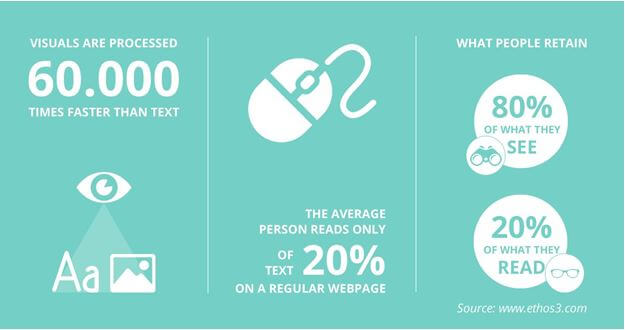
The human brain processes videos more than 60,000 times faster than text. People often face difficulty reading large blocks of text. Although videos will take up more internet bandwidth, for the most part, you won’t have to worry about clients not being able to load them properly due to slow internet speeds.
2.8- Add An FAQ Page
Most businesses know only too well how frustrating it can be to answer the same question over and over again. For customers, the dilemma is to find the information in a speedy manner. The last thing they need is to go through giant walls of text to search for one or two pointers. This is where an FAQ page comes in. You will notice that most popular brands and websites habitually build FAQ pages to answer their most commonly asked questions.
2.9- Clear Product Images
Most online stores are now starting to display larger images for products on their sites to show different features of the product. Make sure to take high quality photos of the product to lift the look of your website.
2.10- Consistency
When it comes to website design, consistency matters a lot. Abruptly changing the color theme, font sizes, headings, and button styles from page to page makes for a jarring user experience. It could distract your users who would feel as if they entered a different website all together. To stay consistent, try to plan the web design in advance. Finalize the right colors and fonts for your buttons. texts, and stick to them through the website. It is good practice to use cascading style sheets (CSS) to help you stay consistent in terms of both style and design.
2.11- Color Palette

A good color combination attracts users and a bad color combinationleads to distraction. This means you should pick the perfect color palette from the get go to create a pleasing environment, thus leaving a lasting impact on users. Enhance their experience by choosing a complimentary color palette that uplifts the rest of your website design. Utilize as many white spaces as possible since they reduce visual clutter.
Don’t overdo it when it comes to colors. For the most part, 3 to 4 color tones to give the dashboard a clear design that is both appealing and minimal. Pick the right colors to send out the right message. Experiment with different colors to see which one works the best. For instance, black and white colors convey chic and professional, while bits of red prevent the design from looking to dull.
The same applies to images and video. Don’t spam your web page with multiple vibrant images. Keep it simple and short.
2.12- Use Hamburger Menus

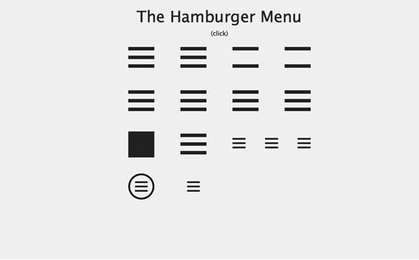
Hamburger menus are particularly useful on smaller screens since you can’t add more than 3 or 4 menus competing for space. Hamburger menus are a subtleway of providing a clear path to the user. Removing larger menus makes the experience distraction free and much cleaner. This also improves the likelihood that the user will find the information they needed to complete their desired action.
2.13- Card UI Design

Card UI design is used to enhance user experience and interface for your visitors. You will see card UIs being increasinglyadopted by online stores and social media sites. This is because they work across all kinds of screen sizes. Cards come in all manners of colors, shapes and forms but they generally all include an icon or image, plus some basic information such as the user name, title, and occasionally, a CTA.
Card UI is responsible and practical. It lets you organize and declutter a messy website with razor-sharp precision and accuracy. This can be appealing to both user and designer alike. The most famous examples of social media sites that use a card design are Pinterest and Dribble. You can use a card design for almost any type of content since there is no one-size-fits-all rule when it comes to a particular style. This means there is plenty of room forcreativity.
To avoid creating a cluttered feel, always try to use white spaces wisely. While the idea is to keep things simple, you should include relevant details where they are needed.
2.14- Compartmentalize the Website Using Grids

Grids are closely related to the concept of balance. Think of them as a series of vertical and horizontal rulers (or ‘pointers’) that help you create a compartmentalized design. While the design itself doesn’t have to be visually appealing, the fact that it has proper structuring of elements makes it easy for users.
2.15- Improve the Website’s Typography to Improve Readability
No matter how good your website’s design is, the text will still play a more important role since it will provide users with information. Moreover, search engine crawlers are good at picking up texts rather than images. This is why typography plays such an important role in SEO. You should use SEO-sensitive elements such as metadata and the keywords to rank higher on search engines.
The two important elements of typography are known as ‘leading’ and ‘measure’. Leading is the vertical spacing or height of the lines while measure is the length of lines. Web developers often use CSS to control the width for the containing box (such as a paragraph element). Both leading and measure affect readability.
For instance, if the lines are too small or too long, the user won’t be able to read the content and will likely have to squint their eyes. Leading can be increased and decreased by adjusting a CSS property called ‘line-height’. A line height of 1.5 works well for most paragraphs.
2.16- Add Lots of White Space Around Elements
Negative space, or white space, makes a website look simple and uncluttered. It lets you create harmony and balance to deliver information to your readers who will enjoy and appreciate the breathing room. Moreover, you can make certain elements stand out by adding white spaces around them.
If you are writing a blog post, make sure to add sufficient spaces in between longer paragraphs to prevent it from looking to cramped up and ugly.
3- Step by Step DIY Guide on Building Websites in 2020 and Beyond!
Before creating a website that is both functional and professional, you need two important things:
- A domain name (which is the name of the website such as mywebsite.com)
- Web hosting (the company that stores your website’s files and folders)
4- Choose a Hosting Provider
While it is free to use CMS platforms like WordPress and Joomla to run your website, in order to properly operate the software, you will need hosting. The cost of hosting depends on how many features you go for. Basic hosting services can cost you less than $5 per month. Most hosting providers let you upgrade services on the go when you want to expand and grow the website.
There are many hosting providers to choose from, including Hostgator, A2 Hosting, InMotion, and even GoDaddy. All these hosting providers have their own pros and cons. For starters, the shared server for Bluehost starts at $2.95, a Virtual Private Server starts at $18.99, and a Dedicated server will cost a significantly higher $79.99.
- i) Shared Servers: As the name suggests, share the same server across other websites. This helps to keep the costs down but puts a limit on the number of visitors that can visit your website. Small websites with modest traffic should try shared plans and scale up as their needs grow.
- ii) Virtual Private Server: These servers are similar to shared hosting, in that, multiple websites share the same resources on a single physical server. The difference between VPS hosting and dedicated severs is the restrictions placed on who can use how many resources. If your website has started receiving a surge of traffic, then going with VPS makes perfect sense.
iii) Dedicated Server: This server belongs to you. It can handle a lot more traffic and give you access to full admin control. The only disadvantage here is that it costs a lot more to run. Dedicated servers only make sense for very top tier sites that make hundreds of thousands in revenue.
5- Domain Name

Of course you will need to find a domain name that is available. You can search for available domain names on godaddy.com (and similar services) for free. If your desired domain name is not available, GoDaddy will show similar names that you can buy.
Make sure to choose a relevant domain name. Although there is no secret formula when it comes to choosing a domain name, there are a few general rules you should follow.
- Stay relevant – Although you won’t easily find a domain name like mouse.com, you can find something similar such as myfreemouse.com. Make sure the domain name matches your site. If your store sells kitchen appliances, don’t register something like, “blackandbluescreens.com”.
- Memorable name – You want your customers to remember the name of your URL. People remember shorter names easily. Think Amazon, Google, and Bing.
- Try Not to Use Numbers – While it makes sense to add numbers next to usernames that have already been taken, it’s a little more awkward when you do the same with domain names. If your domain name spells similar to “premiummouses123.com”, your users will likely not remember the numbers “123” after “premiummouses”.
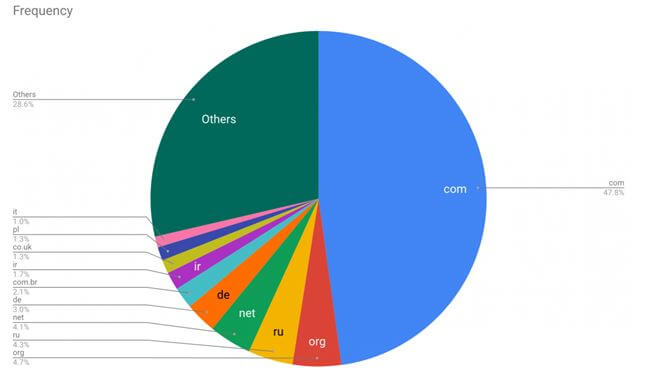
- Choose a .COM extension – Although there are myriad of TLDs available, research shows that the .COM extension continues to stay popular and commands respect from audiences. In fact, over 47.8 percent of all websites end with .COM.
Just make sure to renew your domain name before it expires because if you choose to not renew it, it will be put back on the market. At this point it’s going to be much more expensive to buy the domain back since now you may have to go through a domain broker.
6- Choose an Appropriate CMS

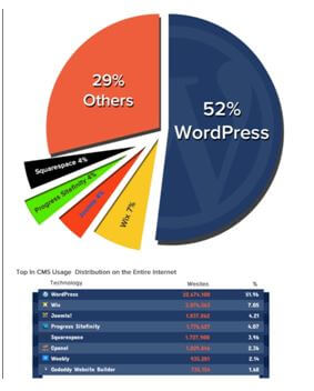
Once you have settled on a domain name and hosting provider, it is time to set up your website. You have an array of options when it comes to choosing the right content management system (or website builders). The most popular of these are WordPress, Joomla, and Squarespace.
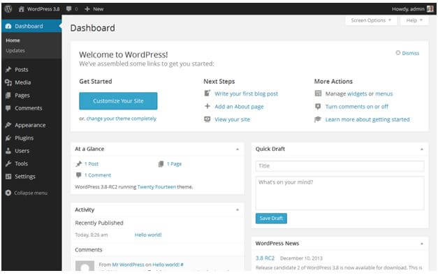
Most people prefer to work with WordPress since it is the easiest platform yet remains flexible enough to suit all kinds of businesses, both big and small. Why is WordPress so popular? Because it lets you create a website using an intuitive drag and drop builder instead of having to learn HTML and CSS from scratch. This can easily take over 6 months while PHP is a whole different ball park!
Premium website builders like Wix, Weebly, and Squarespace are expensive and often not as flexible. These sites can also prove to be difficult for customizing SEO strategies. They are good if you want to design a single landing page, but not more than that. If you want to create flexible and scalable websites, you should look into WordPress and Joomla. Once again, WordPress is much more user friendlier.
7- Choosing the Right Theme or Template

If you choose to use WordPress for your website design, you can choose from a myriad of free and paid themes. Alternatively, you can ask a web developer to design a custom theme for you from scratch. Free themes are a good option if you’re running thin on budget. Paid themes are good because they give you access to more features such as form builders, online store builders, security features, and more.
Once you have selected the template, you can then proceed to use and alter its appearance. While the drag and drop builder is self-explanatory, you probably won’t configure it overnight. You may need the help of an experienced web developer to design anything more complicated than an About Us and Blogs page.
SEO Resellers Canada specializes in web development and have helped small businesses thrive in a different industries and niches. Talk to our representatives to learn more!


