How many times have you visited an e-commerce store, only to go back to the search results without making a purchase?
Millions of online shoppers do that every day, not because they can’t find the product they’re looking for, but it’s just too complicated for them to navigate through an e-commerce site.
Establishing an e-commerce store is easy. Everyone seems to be running an online store these days. But how do you stand out from the competition? More often than not, it’s the user experience that makes the real difference. User experience is mostly determined by the website design.
No matter how sophisticated your e-commerce site is, visitors aren’t likely to stay on it for longer if your website design confuses them.
When it comes to making an impression, you have no more than 0.05 seconds. Yes, it only takes 50 milliseconds for online shoppers to form an opinion about your site and decide whether they should stay on it.
What helps customers form that opinion is your website design. What’s even more eye-opening is the fact that 88% of the users are not likely to return to your site after a bad user experience.
To help you make the most out of your e-commerce business, we’ve put together some of the most effective e-commerce web design tips and practices.
1- Keep the Layout Simple

Think of a physical store for a minute. Do you like walking through a disorganized store with an uninviting atmosphere? Probably not. Now, remember the last time you paid a visit to the Apple store.
The clean, spacious, and comforting environment must have occupied you for hours.
E-commerce is no different. To ensure a cohesive journey from the landing page to the checkout, your e-store should have an easy-to-follow layout.
Businesses often end up cluttering product pages with frivolous functionality and dense text, not knowing what elements help drive sales. Some business owners just can’t decide what’s important.
While reviews, recommendations, and functionalities are important, they shouldn’t muddle the call-to-action, the key to driving sales.
Based on an EyeQuant study, websites with a cleaner look with more white spaces, less text, and bigger images experienced higher conversions and lower bounce rates than those with complex layouts.
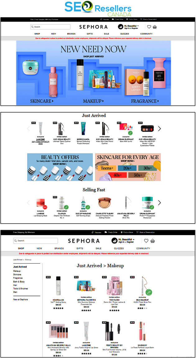
The following screenshots obtained from Sephora’s e-commerce website depict an ideal layout:
Like Sephora, strive for simplicity in your e-commerce web design to create a clean and minimalistic browsing experience.
On Sephora’s webpages, the search bar is easily spotted, the tabs in the navigation bar are well-spaced, and the white space has improved the visibility of product categories, products, and everything else on the pages.
Hence, you should only include elements that will drive conversions. To create a clean layout, you may want to keep the elements aligned together in a grid structure.
Even if you plan on adding a good amount of information, organize the copy using a series of tabs to avoid clutter.
2- Think Like an Online Customer

When designing the layout, consider how a typical human brain processes information. Since people are used to reading from left to right and observe from top to bottom, organize the content placement and the graphic elements accordingly.
As visitors explore a webpage from top to down, they typically follow the F- or Z shaped pattern. Follow this pattern when organizing the content so that viewers go through the pages in the intended sequence.
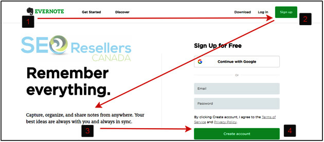
The image above shows how Evernote follows the Z-shaped pattern on its website with the logo being the starting point on the top left, where the journey begins.
Since the human eye follows a Z path, the viewer will normally see the items positioned along the top line of the Z.
In the screenshot above, ‘Get Started’, ‘Discover’, ‘Download’, and ‘Log in’ tabs can be seen along the top line.
The ‘sign up’ button, which is the secondary ‘call-to-action’ is placed at the end of this path at point 2.
Ideally, the sign-up button should be colorful and bright to catch the viewer’s attention.
Next, as the user follows the path to the bottom left, place an appealing image at the center area of the page that will guide the gaze along the Z path.
At point 3, add some valuable information, such as the benefits of a product that will convince the user to make a purchase before they see the ‘Buy Now’ button at point 4.
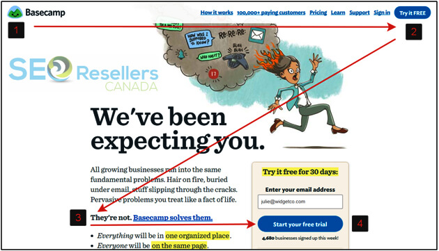
While the primary call-to-action is no different from the secondary CTA in the Evernote example above, you can choose to add a “Start Your Free Trial” or “Get in Touch” button at point 4, as shown below:

3- Add a Search Function

Your e-commerce web design should make it easier for the visitors to find the products they’re looking for.
For many customers, the easiest way to find products is to enter the keywords in the search bar, which forms the beginning of their purchase path.
Customers who are used to searching items through keywords will not stay on a site that doesn’t have a search bar and will look for a site that does.
Even for others, the search functions greatly improve the likelihood of the purchase. Therefore, you just can’t overlook this element.
Besides, the search bar should be clearly visible on the page. Most users look for it at the top right or top center of the webpage, which is why you should use the same space for the search bar.
The search bar should be long enough so that it is easily noticeable and have instructional text such as ‘Enter Keyword here’.
Using a contrasting color should also be helpful. Have a look at eBay’s search function that can’t be missed:
Plus, even before the customers press the ‘search’ button, your search bar can suggest related keywords or products as they type something, just as you see on Google.
You can do that by incorporating a filtering feature in the search bar that immediately sorts through the results.
The screenshot below shows how eBay shows all related keyword suggestions when you type the word “skateboard” in the search bar:

Hence, adding a search function on your e-commerce website should greatly improve your conversion rates if everything else is fine.
4- Include Clear CTAs

If you really want to turn a visitor into a customer in the shortest possible time, you have to have a clear call-to-action (CTA). CTA is a core element that plays the most significant role in converting your website traffic into sales.
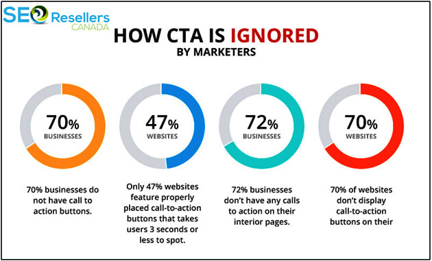
Yet, only 47% of the websites have properly positioned CTAs that can be noticed in 3 or fewer seconds.
The most common types of CTAs include “Add to Basket” or “Buy Now” buttons that are designed to grab the viewers’ attention. No matter how amazingly-designed your website is, having minimalistic CTAs that can’t be easily found won’t produce results.
Keep in mind that if the visitors aren’t able to distinguish a CTA from other elements on the page, you will not have any conversions.
First of all, the CTAs should be displayed in the form of buttons that can be easily spotted. Having buttons makes it clear that the option is clickable.
Experiment with different button shapes for the CTA to figure out which works the best. Use design elements and contrasting colors to make the CTA stand out and encourage visitors to click.
More importantly, make sure that the text of the CTA is legible on all devices.
Besides, the CTA wordings should be short and simple and prompt users to take action. For instance, you can use phrases like “Proceed to Checkout”, “Buy Now”, “Add to Cart”.
Phrases like these work best for those looking to buy something. Others might be interested in learning more about a product where “Read more” buttons can be used as the CTA.
However, depending on what you sell and the needs of the customers, your CTA can vary. Your CTA could be buttons that prompt customers to, “Download App”, “Book Now”, “Shop Now” or “Register”.
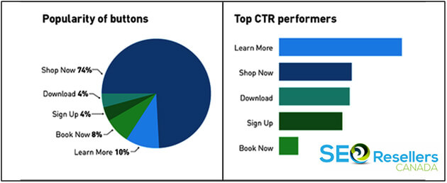
Different CTAs have varying levels of popularity and some perform better than others. Take a look at these stats to learn more:

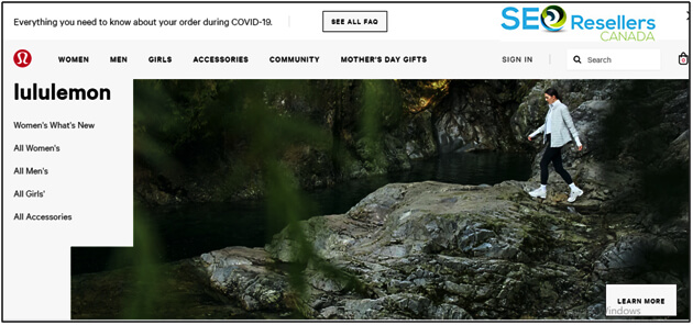
Placing the CTA buttons on multiple areas of the page also adds value to the user experience as users won’t have to scroll up and down the page to find them.

Above is the screenshot of Lululemon Athletica’s e-commerce site that has clearly visible CTAs catering to different types of users.

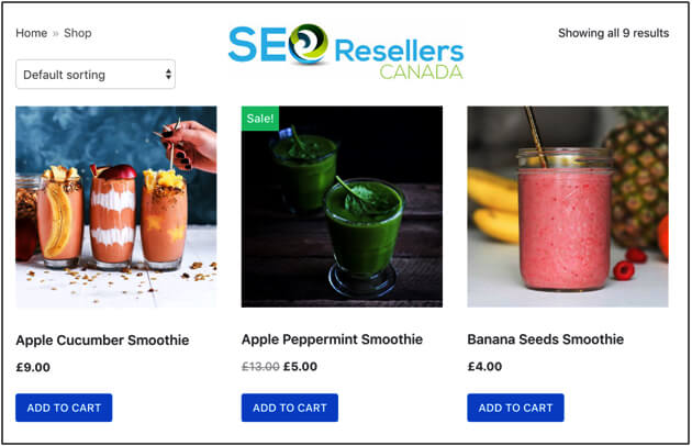
Similarly, the “Add to Cart” buttons shown in the screenshot above is a great way to prompt users into a purchase. All the major e-commerce platforms allow you to add that button with each product on the page.
5- Implement One-Click Checkout

You can increase your conversion rates by adding a one-click checkout process, both for the registered users as well as for guests. If you’ve been selling online for a while now, you must be aware of abandoned carts.
eMarketer recently reported in one of its articles that almost 75% of the shopping carts are abandoned, and the percentage is even higher for those shopping via mobile phones.
According to Magento Commerce, introducing one-click checkout speeds up the checkout process by 90%. Introducing this feature on your e-commerce website can reduce your cart abandonment rate by a significant extent.
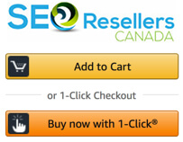
If you have shopped on Amazon, you may have noticed that you never have to take the ‘add to cart’ step and are directed to the checkout quickly.
Since Amazon no longer holds the patent for the single-click checkout, you can add this feature to your e-commerce website now. Here is the easily recognizable one-click checkout on Amazon:
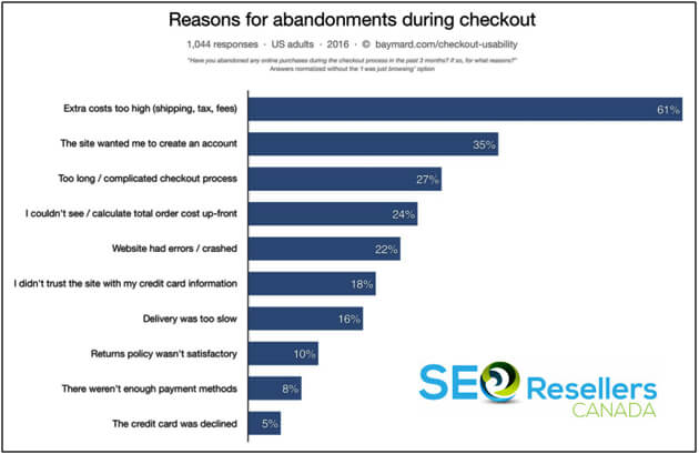
Based on a study conducted by Baymard Institute, a quicker checkout design can result in a 35.26% increase in conversion rates for an average large-sized e-commerce site. The following graph by Baymard Institute shows the reasons for cart abandonment during checkout in the US:

Even if you choose not to implement the one-click checkout, eliminate the data input that is required by the users and keep the process as short as possible. Try to reduce the number of clicks or steps required in the checkout process.
If you’re still unsure, a great way is to A/B test or split test a one-click checkout against a multi-step checkout. This should help you figure out what works best in your case.
Furthermore, if you do choose to go for a multi-page checkout, include a progress bar. Offering better transparency, a progress bar will let customers know exactly how many steps are required to complete the purchase.

Furthermore, requiring first-time buyers to register before placing the order can be a big turn off. Allow them to place the order and checkout as “guest”. Once they place the order, you can ask them to create their account.
Customers often consider checking the return policy, privacy policy, FAQs, or shipping details during the checkout process. Design your website so that this information is available in the form of pops ups so that the customer doesn’t end up leaving the checkout page when they click on any of these links.
When the customer moves onto the billing step of the checkout process, be transparent about the payment breakdown, separately stating the product prices, shipping charges, and tax before the customer completes the purchase.
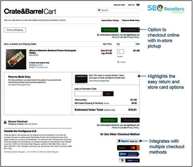
Don’t forget to add the appropriate trust seals and credit card logos next to fields where the user enters the payment information. For each payment method you include, add the respective logo next to the option. Also, make sure the field for the discount code is visible. Here is an example of an ideal checkout page:

6- Include Seller or Product Reviews
When you buy a product, you’re not only concerned about the product itself but also the quality of service. Before you spend on the purchase, you probably want to reach out to former users of the product and inquire about their experience.
That buying behavior is no different from millions of other online shoppers out there. It makes sense to check the product reviews and seller ratings, so you get an idea of what your purchase is going to be like.
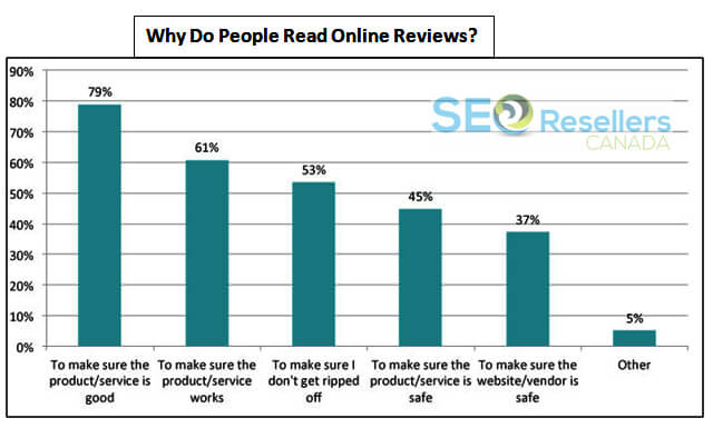
A visitor with some interest in your product immediately considers making the purchase when he reads a positive review of the item. The chart below shows some of the different reasons why people read online reviews, explaining their significance in online shopping:

Even though frauds are prevalent, product reviews continue to influence the customer’s decision-making process. As you can see in the chart above, 79% of the users read online reviews to confirm that the product or service is good.
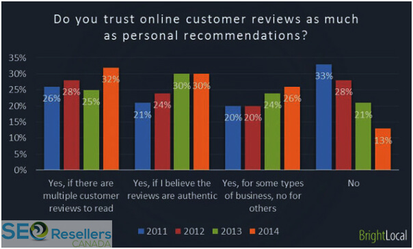
Apart from this, according to a study published on Search Engine Land, 88% of the consumers trust online reviews as much as personal recommendations.

As online buyers give importance to reviews, not having the reviews section can undermine the credibility of your website. This is the main reason why Amazon keeps following up with you to share your review after you make a purchase.
The e-commerce giant is well aware of how customers feel when they don’t see a single review of a product.
The best approach is to display the reviews right below or next to the product. This will instantly establish trust among the visitors.
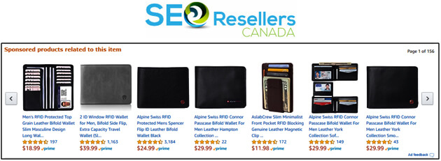
Whenever you search for a product on Amazon, one of the first things you see is the star ratings for each product. Take a look at the screenshot below and see if you can recall the section:

Depending on what you sell, you can show the ratings for different aspects of the products. For instance, if you are a fashion retailer, you can split the ratings into quality, design, fit, and comfort.
To improve the credibility of the reviews, you can mark them as ‘verified purchase’, which explains that the person purchased the product from you before sharing the review.
If you want to further improve conversions, you can present the reviews in the form of pros and cons of the product, compare them with competing brands, and even depict how reviewers used the product.
7- Optimize Your Web Design for Mobile Devices

Apparently, mobile browsing is the new trend, which is why 80% of the top websites according to Alexa rankings are optimized for mobile users. Even as early as 2015, mobile searches had surpassed desktop searches according to Google.
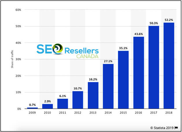
According to Statistica, more than 50% of web traffic comes from mobile devices today. Have a look at this graph from Statistica that tracks the drastic surge in mobile web traffic, year after year:
For the modern customer, convenience is more important than ever. Hence, mobile optimization is extremely crucial.
A website that’s not optimized for mobile phones may take longer to load, show unorganized content, and may have a difficult interface— all of which contribute to poor user experience.
If the checkout process is too lengthy and the website takes too long to load on mobile devices, customers will abandon the cart, thus affecting your conversion rate.
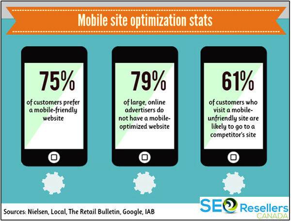
Addressing the trend, more than half of the websites around the globe now cater to mobile devices. Even more alerting is the fact that 57% of the users won’t recommend a poorly designed mobile site to others, which is a big loss as word-of-mouth plays a critical role in the world of e-commerce.
The diagram below shows some notable stats on mobile site optimization:

Many users now own more than one type of device and according to Google, 90% of those people switch between screens during the online purchase journey.
On top of that, optimizing your e-commerce site goes a long way to improve its SEO performance. Recognizing these trends, search engines associate enormous value to websites that are mobile optimized.
Google is well aware of the fact that 87% of mobile users use their smartphones to Google something at least once a day. Thus, you’ll be amazed to know that over 70% of the Google results on page 1 are optimized for mobile phones.
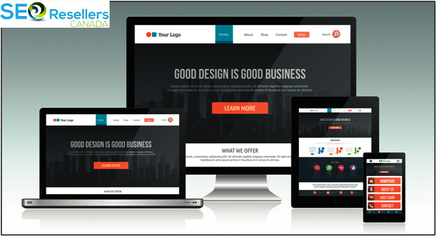
For all the reasons explained above, you must prioritize mobile-friendliness when optimizing your e-commerce web design.
This should ensure consistent user experience and an easy-to-use interface across all platforms.
Ultimately, optimizing your e-commerce website for mobile devices should give a massive boost to conversions.
When it comes to optimizing your e-commerce web design for mobile devices, there are a few critical things to keep in mind.
You will need to examine how the layout of your website translates onto smaller screens, how the navigation works, and whether the most important elements, such as the CTAs, are visible on mobile devices.
In short, your aim should be to make it easy for the users to find what they’re looking for quickly and easily.

Remember, things are different on mobile phones. The internet connectivity is not always as consistent as it is on PCs since the mobile data signals can drop any time, slowing down the page loading times.
Hence, you will need to take measures to improve loading time and optimize your webpage. For instance, using compressed images or a small page size will help ensure faster loading speeds, even with a slow internet connection.
Thinking in terms of conversions, simplifying the checkout process becomes even more important when executing mobile optimization.
Working on a small screen is more difficult so easy checkout is a big priority for customers, who want to quickly add products to the cart, process payment, and leave. To enable this, remove any website element that’s unnecessary for mobile user experience.
8- Use High-Quality Images
Do you know why Facebook, Twitter, Instagram, and Whatsapp became so popular all over the world? They relied heavily on visual content! With a smartphone in everyone’s pockets and the ability to capture photos whenever they want, the modern customer is programmed to react more positively to images than to text.
The same rule applies to online shopping. In e-commerce, no one likes buying a product without seeing it first. Hence, customers expect to see pictures of the product they are buying.
It is a proven fact that images help increase conversions, yet the rate of increase depends on the quality of images and how you display them on your e-commerce website. Various aspects need to be considered when focusing on imagery:
8.1- Size of the Images

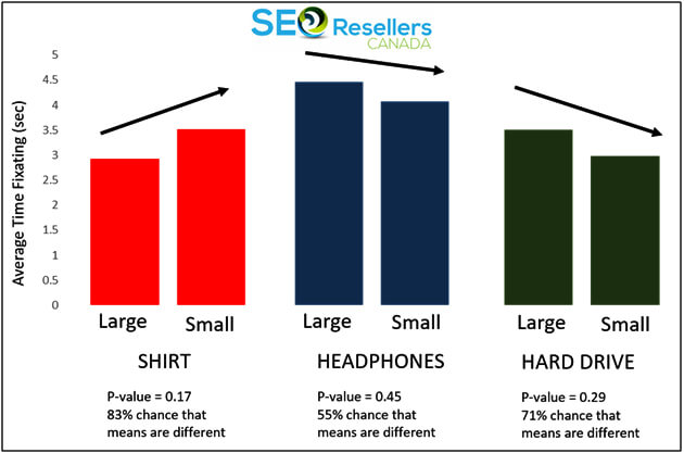
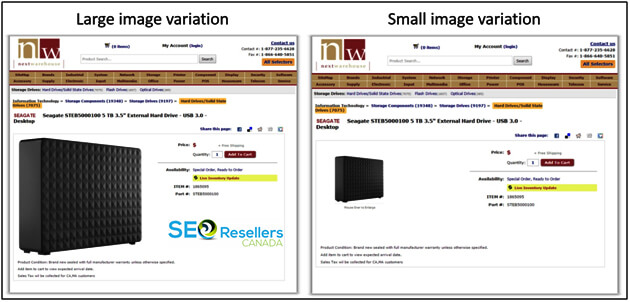
The above study found that viewers tend to consider search goods, such as hard drive, as more valuable when a large image is used for product display, while they regard experience goods, such as a shirt, as less valuable when it’s displayed using a large image.
For your e-commerce webpage, use A/B testing to compare how different image sizes work for different products and choose the best image size for each product category.

8.2- Image Quality
Image quality is crucial to make the desired impact on online customers, who attach great importance to images when it comes to making decisions. Proper lighting and staging are critical aspects affecting image quality.
Image size is also very important. The larger the image, the better the image quality. However, adding too many large images increases the loading time of the page, which affects the conversion rate and your SEO.
Therefore, before you upload images on your e-commerce site, be sure to optimize them on all the above-discussed aspects.
8.3- 360-Degree View

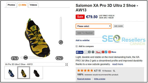
The 360-degree feature allows your customers to see the product from every angle. This feature enhances user experience as they can explore the product in its entirety before ordering it and increases sales.
Hence, it is important to use dynamic image technology that allows viewers to rotate the images and see from different angles.
Even if you don’t implement the 360-degree view, showcase the different aspects of your products through a well-curated set of images that offer the best user experience.
Here is an example of the 360-degree view function:
8.4- Zoom Function

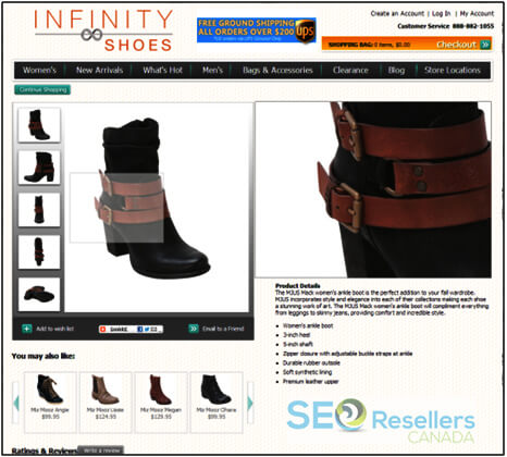
The zoom feature allows shoppers to take a closer look at a product and study it in detail. Providing a close up indicates that your products are of high-quality and helps to build trust and confidence in your customers. The function is commonly used by websites and marketplaces. This is what it looks like:
9- Display Scannable Content
When it comes to adding product descriptions, avoid using large chunks of text simply because no one reads them. Studies reveal that visitors read not more than 20% of the text on webpages.
It’s true that valuable product information helps drive conversions, but a typical online customer will only scan the content instead of reading every word and will pick out key information from it.
Thus, make product descriptions, features, and other content scannable.
Break down the large blocks of texts on your “About Us” page and blog posts so that they are easy to read. Shorten the sentences and paragraphs and consider using a bullet format wherever possible.
Bullet points are also common for listing down the product features and specifications. If you want to highlight some information, make it bold.
Just remember that if the information is easy to scan, your message will be clearer and your chances of making a sale will improve.
10- Prioritize SEO

Mobile friendliness is not the only aspect that impacts your website’s search engine rankings. Everything that you do on your website must be thought-out in terms of SEO, which is a lot more than including a few keywords in your blog posts.
According to a study, 93% of all internet browsing begins from a search engine. Thus, failing in this area means that you will never be able to get a good amount of visitor traffic on your e-commerce site.
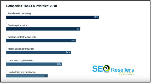
Ideally, you should be focusing on social media marketing, on-page SEO, high-value content, mobile search optimization, local search optimization, and building and monitoring backlinks.
The following factors were ranked as the top 6 SEO priorities for companies in 2018. Take a look:
Based on the diagram above, on-page SEO stands as the second-highest SEO priority.
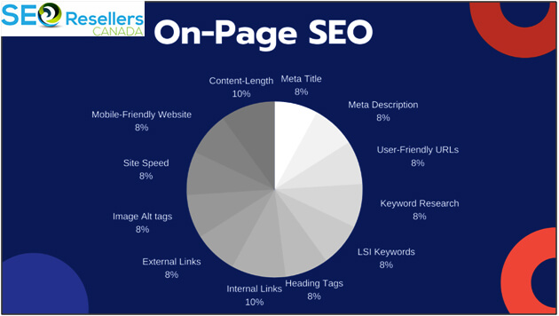
There is a whole set of web design elements that can affect the search engine rankings of your e-commerce site. You will need to optimize the following elements:
- Titles of different landing pages, such as the “About Us” page
- Subheadings on product pages in blog posts
- URL Structure with keyword-centric, readable URLs, especially for product pages and blog posts
- Alt-text for all images
- Meta Descriptions with appropriate keywords for each landing page on search results.
- The content on the webpages
- Internal links

Besides focusing on the above-mentioned aspects, create an XML sitemap for your e-commerce website that makes it easier for search engine spiders to crawl your website to analyze the content.
Google crawlers, for instance, can easily locate a page on your site, study its relationship with other pages on your site, and identify how frequently it was updated.
Based on this, Google ranks you on its search engine and determines whether your content is unique or not.
11- Conclusion
To sum it all up, the goal of your e-commerce web design should be to optimize conversions and to enhance user experience. While it’s important that your site communicates your brand personality, the user experience is just as important.
You need to put yourself in the customer’s shoes to understand how different elements of your website design can improve and accelerate the buyer’s journey.
If you’re able to hit the right points, such as the 10 key areas discussed above, you should see a significant reduction in bounce rates and an incredible increase in conversions.
Just remember that every time you make a change in your e-commerce web design, be sure to analyze its impact on the appropriate metrics, such as the conversion rates. This will help you determine if you have taken the right steps.


