When it comes to your website, first impressions matter a lot more than you think.
When a visitor accesses your website for the first time, they are going to make a split-second judgment based on the overall layout and design of your website irrespective of the page they land on.
Their decision to stay on your website and explore it further will be dependent on that first impression.
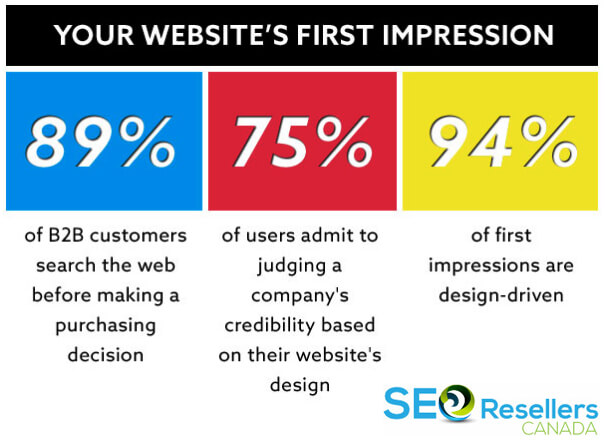
Nearly three-quarters of consumers back this up, as they claim to base their impression of a company’s credibility based on its website design.

Apart from that, a further 94% of first impressions will be based exclusively on the design of the website. So, before visitors on your website even read a single word of copy, they will have had formed an impression of your company.
That’s the reason why it’s imperative that you practice good website design protocols that have a direct impact on conversions. The goal is not only to make your website beautiful but to ensure that it acts as a functional conversion machine as well.
The reason you’re here right now is that you want to improve the design of your current website or are trying to go about designing your new website.
Web design is the umbrella term used for the process of creating a website. That involves website layout, graphic design, and content production.
It’s vital that you are aware of web design best practices in 2020 as it could be a major contributing factor behind your business performing well on search engines and gaining more online visibility.
Yes, good web design does have a bearing on your search engine rankings as well, which is why you must pay attention to it.
Consumers today are more knowledgeable and less patient when it comes to websites that don’t follow accepted design protocols.
So, let’s get started by sharing the 20 web design best practices that ignite conversions.
Contents
1- Use of Consistent Branding

Most marketers tend to misunderstand how branding works, specifically how website branding influences conversions.
Marketing or advertising products involves talking about important aspects of that product or service to illustrate ways that a product is better than your competitors and promoting it on various platforms.
That’s vital to the success of a brand, but branding is more involved and requires talking more about products than services.
When it comes to branding, you’re evaluating and analyzing each aspect of the brand and the image that you’re projecting to the world.
Therefore, branding can involve various digital assets like graphics and photos on your page, videos, podcasts, and logos, to promote the brand. Most entrepreneurs believe that branding is one of the most important components of any website.
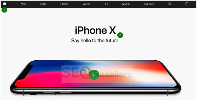
Apple is a company that has mastered the art of branding, and that goes beyond the distinctive Apple logo.
Every element of Apple’s website conveys its brand values, which are sleek design, elegance, and useful tools.
There are several important branding decisions on the homepage, like the placement of its distinctive logo in its traditional spot.
A brief headline follows with a subheading that conveys the brand goals, and the last aspect is a sleek product photo that attracts all the attention.
So, when you start planning for and designing your website, you must keep your brand image in mind. Everything you do on the website should help you build your company’s image and brand identity.
You must also imagine your graphics, logo, and other digital assets on other platforms as well.
2- Intelligent Use of White Space

White space, also known as negative space, gives elements on the website room to ‘breathe.’ If you end up grouping items close together, you run the risk of overwhelming your visitors with too much happening on the page and forcing them to click away from the page.
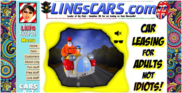
The last thing you want is a cluttered web design for your website, which will drive consumers away. An extreme example of what we’re talking about is as follows:
Some mistakes can’t be rectified, and the designer for the web page shown above will need to completely revamp their website to fix the page.
When you’re designing your website, you must use padding and margins to enhance space between images, copy, and other elements on the website.
3- Collect Specific Data from Website Visitors

You can boost conversions on your website by learning about web design best practices, but you must remember to give your audience what they want; otherwise, it will all be for nothing.
Best practices offer you a great starting point. However, once you’ve designed your website that follows all the rules, you should start testing and experimenting around.
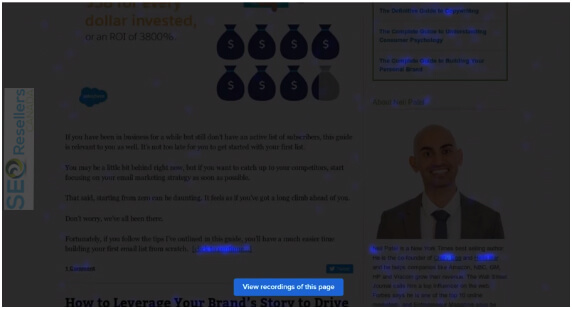
Start with heat maps as they show eye-tracking information, which will give you a better understanding of how your visitors are consuming content on your website.
Scroll maps are also effective if you don’t want to use too much valuable space. So, when visitors on your website stop scrolling, you would have a CTA shown in front of them to ensure that all essential information lands above that point.
Another step you can take is generating confetti reports to understand your audience better, and once you’ve gathered enough data, you can start A/B testing.
Test each element at a time, so that you know what’s influencing any disparity between conversions on your website.
4- Remove Sliders and Carousels
The use of sliders and carousels were considered a web design best practice at one point in time, but they have quickly grown outdated and are frowned upon by consumers in 2020.
They are considered an unnecessary distraction by many, to the point that most web design experts claim that these rotating banners are evil and must be removed from websites.
Sliders and carousels bloat web pages, waste the time of visitors, and push down the navigation and other relevant content. If your goal is to enhance conversions, you should eliminate these rotating banners from your website.
5- Create Landing Pages for Paid Ads and SEO

Web design best practices may vary, depending on how you’re using a specific page on your website. It’s important that you target your landing pages for paid ads or organic search and not for both at the same time.
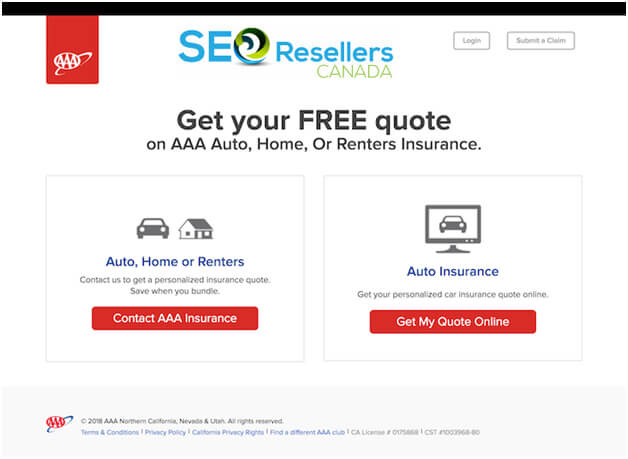
For instance, let’s compare two insurance company landing pages, one that was found through organic search and another through paid ads.
The first one is simple and plain in design, as its goal is to move people through the conversion funnel.
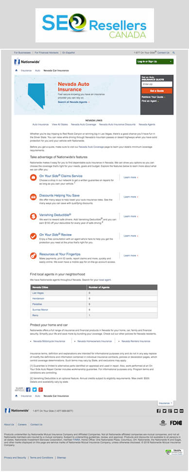
It hardly has any text. Let’s compare it with this next landing page:

There’s a massive difference between the two pages because the first page had been designed for paid search, and the other page was designed for organic ranking (SEO).
If you’re paying for social ads or Google ads, you don’t need to implement SEO as people are going to see your page based on how much you’ve bid for clicks.
However, if your goal is to rank high, you will need long-form content, similar to the second example shown above.
Using more words allows Google to figure out what you’re saying and how users are going to benefit from your services.
6- Don’t Use Generic Stock Images

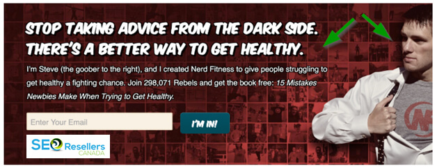
When using images on your website, use original human faces in the images more instead of relying on generic stock images.
A human face will elicit emotional responses from the target audience, which will trigger them to feel something, whether it is empathy, excitement, or happiness.
We’re programmed to read human faces; whenever we see someone in person or view a photograph on a website. Our expressions can influence how we end up feeling about someone or something.
You can use pictures of real people to tell people where to look or how to feel about something.
For instance, if you’ve got a photo of someone looking at your CTA or headline, your website visitors will be compelled to look at it as well.
The above example also uses other elements of web design best practices, like implementing contrast and color, to draw the attention of the users.
7- Animate Top Bars and Pop-Ups

This web design best practice is a bit tricky because animated top bars and pop-ups can either help or hinder your website conversions.
The reason is simple; if your animations end up annoying your visitors, they’ll click away without bothering to look around your website, which is why you must be subtle.
When done properly, slight animations can work as a treat as they help draw attention to the CTA and will boost conversions.
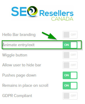
You can use Hello Bar, where there is an option for you to animate your CTA:
You also have the choice to animate the entry and exit to ensure you have a more attention-grabbing CTA for your website.
8- Use Contrast and Color to Your Advantage

Contrast helps a lot of website elements stand out from the rest of the pack.
If you’re looking to convert your users to an offer, you should ensure that you’re using greater contrast in those specific areas.
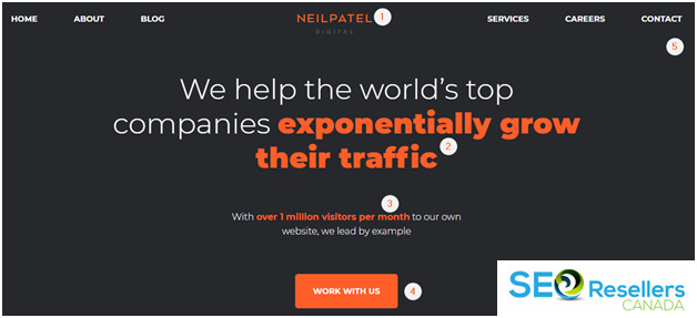
For instance, if you visit Neil Patel Digital, the home page uses a contrast through a signature bright orange color so that users look at where the website wants them to look.
We’ve numbered all the areas that are going to stand out due to contrast and color, which include the logo for Neil Patel Digital, the benefit of working with them, the proof that they know what they’re doing, and lastly the CTA.
The goal is to ensure that visitors click on one of the orange CTAs, and this subtle trick will be effective for boosting conversions on the website.
9- Apply the Rule of Thirds

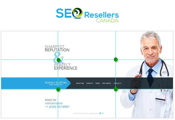
The rule of thirds has been applied to photography and fine art, but it also applies to web design. So, when you’re designing your website, you should use an overlay with two vertical lines and two horizontal lines spaced evenly.
The green dots are the points at which the eye naturally drifts towards when looking at a scene, whether it is a web page or a landscape photograph.
With this knowledge, you can place or position your CTAs and other important elements on those dots or around them.
Just ensure that the rest of your website design flows naturally around those elements. It is a compositional approach that can work for any kind of website or type of website.

In the above example, the attention of the user is drawn towards the tagline, the menu, and the logo.
An improvement would be to move the CTA “Make an Appointment” to the top right intersection and adjust this picture accordingly. That way, the CTA will be viewed by the eye immediately.
10- Reduce the Number of Choices Offered

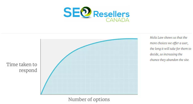
It is stated in Hick’s Law that when you increase the number of options offered to someone, the time taken for a decision will increase as well. It’s also referred to as analysis paralysis.
UX experts state that, when faced with an overwhelming choice, the most effective way of encouraging users to make a decision is to suggest a course of action.
That’s the reason why so much emphasis is placed on CTAs during the conversion rate optimization (CRO).
So, instead of offering your visitors with 20 products on the homepage, you should only suggest one and make sure it’s the best one you have.
11- Compress Images as Much as Possible

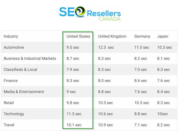
MachMetrics, a website speed monitoring service, revealed that the ideal website load time is only 3 seconds. However, when you look at industry averages, most of the websites around today load much slower than that.
The above picture shows the average loading time for websites in the United States when roughly compared against website speeds in other countries. You can see where websites from the US are lagging behind in certain industries.
The reality is that short attention spans today don’t allow for longer load times. So, if you want to boost conversions, you must find ways to reduce page load times so that your page speed improves.
One of the best methods for doing that is by compressing images. As a web design best practice, don’t upload images that are no larger than what the screen size demands, and you should also compress them after uploading them on your website.
There are several WordPress plugins that help you do that.
12- Add Breadcrumbs

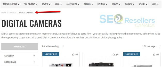
Your website is like a map with a lot of disparate destinations, meaning that your visitors can land on any destination based on how they have arrived there. Still, they should also know where they are on your website.
The solution for that is to add breadcrumbs, which act as markers telling a visitor which section of the website they are currently viewing.
Almost all websites use breadcrumbs, and, if they want visitors to click on a previous page, they can easily do so because of these breadcrumbs.
They are even more important on e-commerce websites, especially those with hundreds of nested categories since they don’t want their visitors to get lost or lose interest quickly and give up. If they can’t find what they want on your website, they are going to jump ship and go to another website to search for it.
13- Group Similar Elements

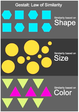
According to the Gestalt Principle, also known as the Law of Similarity, whenever we view an image, like a website’s interface, we automatically group similar objects in our minds.
The Interactive Foundation states that similarity can be achieved by using basic elements like shapes, sizes, and colors.
How does this help boost conversions on your website? When you experiment with shape, color, and size on your most important pages, it builds associations.
For example, you can group a testimonial text and a CTA to one another on a landing page, like this:

So, even though the CTA and the testimonial have nothing in common, the eye perceives them to be two parts of a whole because they are similar shapes and colors. So, after reading the testimonial, users may be more willing to click on the CTA.
14- Use Familiarity to Your Benefit

Consumers today have been conditioned to expect certain things when they visit a website for the first time. For example, if they were shopping for a product and they visit an e-commerce store, they are going to be conditioned to look for the “Buy Now” or “Add to Cart” CTAs.
There is a reason why Amazon uses the “Add to Cart” CTA on nearly all their product pages because it is familiar to users.
When consumers see this button, they know exactly what they must do. It’s great to experiment with various CTAs, but you shouldn’t stray too far from the norm, or else your website visitors may no longer understand what you’re telling them to do.
15- Mobile Responsiveness
Mobile responsiveness is one of the leading factors for higher rankings on search engines and conversions on websites.
Almost a third of all online users prefer shopping on their mobile phones, and if your website isn’t mobile-friendly, you are going to lose out on all those customers.
Nearly 80% of all consumers start their search for a product or service from their mobile phones today.
Google is the most popular search engine, and that’s why you must ensure that you have optimized your website for mobile responsiveness.
You must also consider that users are going to be coming to your website from a multitude of different devices.
Some may use a shopping app; others may come from Facebook after getting recommendations from friends or may access your website directly from their mobile phones.
A mobile-friendly website has become an industry standard today, and you’ll lose traffic and conversion if you don’t get with the times quickly.
All these pieces of information matter and must be monitored so that you’ve got a better understanding of your target audience and where they are coming from. The more information you have about your target audience, the better you will be at reaching out to them.
16- Use Silos or Topic Clusters

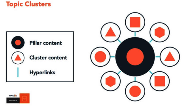
Silos or topic clusters are simply advanced methods of organizing the content on your website, and when done properly, these techniques can have positive effects on your online visibility and rankings.
To accomplish this, you would need to create a central Pillar Page that broadly covers every topic.
You would then need to create around 15 to 20 blogs on various sub-topics of the main topic of your Pillar Page. These sub-topic blogs must only link to the Pillar Page and other blogs in the same cluster.
Hubspot has done an outstanding job of executing this strategy, and this strategy is used by a lot of websites today with great success.
17- Use Analytics Tracking

You don’t need to have a background in data analytics, and digital marketing to successfully set up and monitor conversions, traffic, and goals. After all, if your goal is to create leads or sales through your website, you will want to have access to this goldmine of information.
Several online resources can help you do this properly, but if you have a web designer, they should have no problems in connecting your website to Google Analytics and setting up goals that you can track on a basic level.
18- Keep Your Website Secure
Whether you decide to sell products online or simply offer services to clients, you need to ensure that your website is secure.
This is vital not only for the safety of your visitors but also for the safety and security of the website itself. Millions of websites get hacked every year mainly because they have out of date themes or plugins, they don’t have the latest security updates, have security plot holes, data leaks, and compromised weak passwords.
You can do yourself a massive favor and your customers by taking some proactive steps to safeguard the security of your website.
Start by installing an SSL certificate to enable an encrypted connection to your website, and then install a security plugin that is compatible with your website.
Then, have your web development team ensure that your CMS platform and plugins are always updated to their latest version, so they aren’t vulnerable to hacks or cyberattacks.
19- Including a Strong Call-to-Action (CTA)
Most website owners today have great looking websites that offer a positive user experience to customers, but they still don’t have great conversion numbers.
The reason for that is that they tend to neglect one of the most important aspects of a great website, which is a strong ‘Call-to-Action’ button.
It is the last thing that customers see before they leave your website, and it’s the most important factor that gives your customers the extra incentive for making a purchase.
These days, most website owners consider it to be the final stage of “the buyer’s journey.” Websites today are designed to more client-oriented and less sales-oriented.
This is mainly because people have become desensitized to ad-related copies. With so many commercials and ads shown across the world, people have become immune to them.
Today, TV shows, radio programs, and online websites are filled with advertisements, which is why they have lost their charm and appeal somewhat.
That’s why website owners today must focus on creating the best customer journey through their website so that the natural response at the end of the journey is a sale that converts.
It’s imperative that you direct your customers towards the action you want them to take at the end of their journey. For instance, if you want them to sign up for your newsletter, you should ask them to do that.
If your goal is to have them buy a product or service, ask them to “click on buy it now” or something similar. Direct the customer to do exactly what you want, so that there is little confusion about what they must do at the end of their journey.
20- Importance of Logo On Your Website
Your brand logo is a critical aspect of your brand and must be displayed proudly on your website to direct conversions.
It must be the first thing that customers see when they enter your website, blog, or social media pages. You can experiment with different placements of your logo, and there are numerous studies that have shown where exactly you should place the logo on your website.
The Nielson Norman Group did a study on logo placement, and their results showed that nearly 90% of users are more likely to remember logos that are placed in the standard upper-left-hand side of the website page.
Placing your logo here is also a great way to ensure that Google’s algorithms pick up the logo under the ‘image’ search option that most people use now.
21- FAQs on Web Design Best Practices
We understand that not everyone is going to know a lot about web design best practices in 2020 that will result in greater conversions.
Therefore, we have decided to answer a few of the most commonly asked questions regarding web design best practices that ignite conversions here.
- Does the website contain multiple H1 tags?
There shouldn’t be multiple H1 tags on any page. The H1 tag is the focus of the page’s main topic and should only occur on the page once.
If you include more than one H1 tag on the page, it will dilute the focus of that page.
- Is the website easily crawlable?
One of the biggest problems that can negatively impact a website is the occurrence of 4xx and 5xx error pages.
If your website can’t crawl because of these issues, you will see a decrease in performance because search engines will not be able to crawl the website effectively.
- Are error pages properly configured?
Problems can occur when error pages aren’t properly configured. It is important to properly configure error pages as that helps search engines see what pages are working and which ones aren’t.
For instance, if you have 200 working pages, but they display “Page Not Found” as an error, then search engines won’t read these pages as 200 working pages.
This will cause conflicts in crawling and indexing, and the safe solution would be to ensure that all these pages display their proper status. So, 4xx pages should display 4xx errors with 4xx statuses.
Using any other configuration will only create confusion and won’t help. Identifying these issues and correcting them will enhance the quality of the website and result in more conversions.
22- Conclusion
Website design isn’t rocket science, but it’s something that you shouldn’t take lightly, especially if your goal is to ignite conversions.
It’s best that you work with professionals who have a proven track record in helping revamp websites and fix them according to industry best practices. Once you’ve found the right web designers have them test out everything on your website, so you know what works for your target audience.
When you use actual user behavior to validate your gut instincts about what works, you will boost your conversions exponentially and make a substantial profit.
The 20 web design best practices that ignite conversions we have shared with you will help you generate more traffic, leads, and sales. Most of them are based on human psychology, so you can trust that they will work in your favor.
If you’re looking for web design best practices that ignite conversions get in touch with SEO Resellers Canada today.
