When it comes to designing a landing page, most often, marketers emphasize everything appealing.
While, of course, the landing page must appeal to the customers, that isn’t the only thing that helps drive a huge chunk of traffic to the top of a sales funnel. The landing page’s ability to convert the traffic into paying customers matters, too.
You might have spent a fortune hiring a digital marketing agency, invested thousands into Google ads, may have produced the best acquisition model and even have epic solutions to outrank the long-form content on search engines, but if you don’t have a good conversion rate, your efforts and money are just going in vain.
Before you waste more money, push your visitors to a dead end or damage the ranking any further, it is time to put an end to this problem.
How, you might ask? By hiring Victoria SEO company for landing page optimization. Because only experts will focus on the things listed below to convert your visitor into paying customers.
Seven ways to optimize your landing page to boost the conversion rate
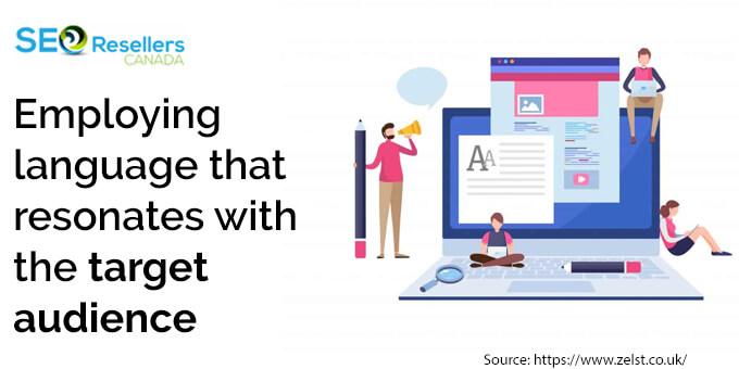
1- Employing language that resonates with the target audience

The most useful tool for any marketer is copywriting.
Almost every tactic you know about persuasive writing can be employed to develop attractive and appealing landing pages.
However, you cannot just go about writing anything and everything for your landing page. The SEO-friendly content writing copies you or your chosen Kelowna website design writes must resonate with the target audience. Your copies must contain emotions that hold value for the end user.
The easiest way of getting into this mindset is to understand what problem you can solve for your audience.
Also, before you start with the draft, it is imperative to consider things like –
- Age
- Gender
- Ethnicity
- Income
- Family status
- Interest
- And Occupation of your audience.
We agree that not all of these points might be relevant, but considering them will only help you create copies that lead to conversion.
Also, note that your landing page should not be complex. The little real estate you get, you have to use it wisely to make an impact on the visitor.
2- Keep things bare minimum
Quite often, when a digital user lands on your landing page, he/she might have 5 to 6 tabs more open in the background that ranks for a similar keyword as your page.
Such users are generally impatient. They ruthlessly scan every page that attracts their eyes and immediately click “X,” when they determine the page isn’t solving their problem instantly.
In such a cutthroat condition, you cannot afford to mess with the website design Victoria. Consider using a short yet impactful heading for the landing pages. This is because 80% of digital users only read the headlines. If your landing page’s headline cannot communicate your product’s perks and convince the user to stay longer on the site, you are doing everything wrong.
When creating a headline, try using words that invoke emotions or let the users know they are important. Just bear one thing in mind, avoid using garbled translations or sentences that make no sense because that will only confuse the visitors.
In short, state exactly what your product does or what it is capable of offering. From there, you can cut the sentence down to a few words that manage to deliver the message.
3- Make the visitor trust your brand

Almost every marketer is aware of the fact that customers only buy from brands that they are aware of, like and trust.
In the real world, of course, it takes years to build trust. It doesn’t have to be like that digitally.
To build trust in your digital visitors, consider adding elements that make them rely on you, such as –
- Testimonials, showcasing other customers and companies trust you
- Photograph of a real person. Perhaps your own or one of your customers (in testimonies).
- Add contact details
- Provide a money-back guarantee
You don’t necessarily have to include all the elements; just adding one or two can go a long way, too.
4- Design a landing page that is psychologically appealing
When it comes to marketing your brand digitally, there is nothing wrong with adding elements that appeal to the users psychologically. In fact, almost every digital marketing agency Canada incorporates such elements to ensure the end user is compelled to take relevant actions.
When designing a landing page, add 10 important elements, such as –
- A logical yet concise heading
- A noticeable Call to Action (CTA) button
- Visual elements to draw the visitor’s eye to the CTA button
- An excellent body copy that is grammatically accurate
- All the crucial elements placed above the fold
- Impeccably designed visual elements that fortify the ad copy
- Matching written copies on the landing page and the ad
- Limited links
- A/B testing
- Trust indicators, such as guarantees, social proofs, testimonies, logos, etc.
Whether you hire a local SEO agency or an in-house design expert to design the landing page, ensure that they prioritize these elements while considering the web design Victoria. If these elements get added to your landing page, you can stay assured of expected returns from the page, too.
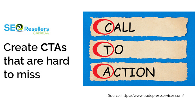
5- Create CTAs that are hard to miss

As a marketer, you might understand how important a CTA is. In fact, on a landing page, it is CTA that plays the most role. If people don’t click on it, your business will eventually die. And if people aren’t clicking on the CTAs, it is probably your mistake for not making the button clickable enough.
Effective CTA optimization done by web design reseller experts can make a huge difference in your ROI.
A good CTA is more than just a button. Hence, you must give it proper thought while designing.
Here are some things White label SEO companies take care of when designing a CTA –
- Incorporating relevant language in the CTA copy, such as download, start, join, buy, etc.
- Make it visually appealing, so it stands out.
- Incorporate design elements that invoke instant gratification.
The more your CTA button is capable of sticking out, the more it will get clicked by potential customers.
Here are some words that you can use to create a sense of instant gratification –
- Get
- Buy
- Quick
- Results
- Today
- Now
- Kickstart
- Overnight
Avoid using words like –
- Submit
- Request
- Start
- Or learn
They tend to imply delayed gratification, thereby demotivating the visitors.
The notion is to make the customers get caught up and involved in the process. You need to reassure your digital users that they will “get” results and that, too, “now.”
6- Eliminate any and every distraction from the page
Distraction is one of the worst enemies of your landing page. People nowadays get distracted easily. It takes just one funny cat gif for digital users to leave your website within seconds.
In most cases, marketers have less than 15 seconds to impress digital users and get them to click on things they want.
Of course, you won’t have a funny cat gif on your site to distract the users, but there might be things on your responsive website design that might distract the users, including –
- Numerous navigation links
- Details on something other than the offer (for example, “check our latest blog”)
- Slow-loading and infuriating pop-ups and cookies.
Here are some tips to eliminate some distractions –
- Cut back the navigation links, especially if you have a nav bar up there.
- Get rid of extra clutter from the landing page. It can be tempting to include various announcements on the landing page to drive traffic; it is not a good idea though. Besides high-quality link building, we don’t think you will make enough money only by getting people to read your blogs and purchase nothing.
- Lastly, disable pop-ups. Let them stay abled on other pages. But pop-ups are a no-go, especially on a landing page. They can drop the conversion rate significantly. Remember, pop-ups are annoying. They annoy people. And we all know that annoyed people don’t purchase anything!
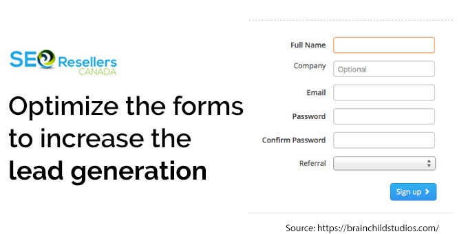
7- Optimize the forms to increase the lead generation

One thing that most people dreaded about opening a bank account back in the day was the pages and pages of the form. Of course, now everything is digital, but filling out the forms is never appealing.
Don’t give your customers this hellish experience when they visit your website. Trust us; you will end up driving more visitors away than you might rope them in.
Similar to the SEO website design, consider keeping the forms to the bare minimum, too.
We know creating a lead capture form can be tricker, but try creating one with a minimum number of fields. If you can work with just an email ID, why bother to ask for a phone number, full name, age, birthdate, address, etc.? Unless you are actually a bank, we suggest you keep the form as simple as possible.
By reducing the unnecessary fields from your form, you make it simpler to fill, providing the users less room to make errors.
This simple step can help you amplify the number of registrations. And when you have higher registrations, the chances of conversions increase, too.
8- Insert social proofs
Social proofs are elements that compel people to copy other people’s behaviour. They can be used as psychological perceptions, enticing people to do something because someone else did it, too.
And since social proofs are first-hand client reviews, they instantly invoke trustworthiness towards the company.
By choosing to incorporate social proofs in your landing pages, you make your messages more impactful. For instance, if you hire a local celebrity to praise your products or services, you will likely notice the said product and service gain widespread popularity. This response from the customers is bound to positively impact the conversion rate.
Other vital ways SEO consulting company add social proofs include –
- Influencers
- Testimonials
- Experts
- Brand ambassadors
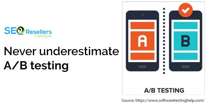
9- Never underestimate A/B testing

A/B testing is a process where an expert or SEO link-building company defines two versions of the same websites to different visitors.
The comparison done for each section’s performance helps gain an idea of how to boost the conversion rate.
A/B testing also helps understand the determining factor that leads to the conversion process. Without relevant tools at aid, you may not be able to identify what actually triggered the audience to convert successfully.
While A/B testing may look straightforward, in reality, it is just the opposite. And this is why brand owners consider working with the best web design companies in Canada. Such companies are well-equipped with tools, resources and skilled keyword research experts to successfully complete the testing between two or more layouts.
This experiment strategy can work as a scientific test. And can be used to make small changes one at a time that result in more significant impacts on the overall marketing strategy.
When working on A/B testing, ensure to focus on closing every test as an individual experiment and not a blend of A and B.
For instance, if you determine that A is resulting in a higher rate of conversion, don’t discard B just because of the inferiority. Instead, understand that every segment communicates with a different audience.
For better outcomes, work with SEO Outsourcing Canada. This is because experts can help weigh both the pros and cons on both sides and utilize the pooled outcomes to enhance your client base.
10- Wrapping up
Although landing pages are the most crucial aspects of online marketing, they are quite challenging to get right.
If you feel that your efforts and money in producing an effective landing page are going in vain, consider speaking with the experts at SEO Resellers Canada.
Using our expertise, relevant tools and SEO Victoria knowledge, we can develop a sound landing page for your brand – one that motivates your digital visitors to take relevant measures that leads to elevated conversions.
Our web design services in Canada are affordable, efficient and everything your business needs to do well in this competitive digital landscape.


